외국계 회사에 다니다보면 영어로 프레젠테이션 할 일이 종종 생긴다.
프레젠테이션에 많은 비중을 차지는 그래프/데이터 읽기는 어떻게 할까?
그 중 디지털 디지털 마케터에게 가장 직면하기 쉬운 상황인 웹사이트 트레픽을 이용하여 필요한 표현을 익혀보겠다.
먼저, 프레젠테이션을 시작할 때, 트레픽 데이터만 설명하려 프레젠테이션을 할 일은 드둘기에 그동안 진행한 마케팅 활동을 공유하는 프레젠테이션을 하는 상황에, 첫 파트가 트레픽일 경우를 상정해보자.
Today, I am gonna give you a presentation regarding Marketing activities in Aug.
first I am gonna let you know the website traffic data in Augest.
the total traffic was 7,689 users and the average traffice was 245 users. but, compared to july, there was a big decrease by 35 percent due to shortage in adversting budget.
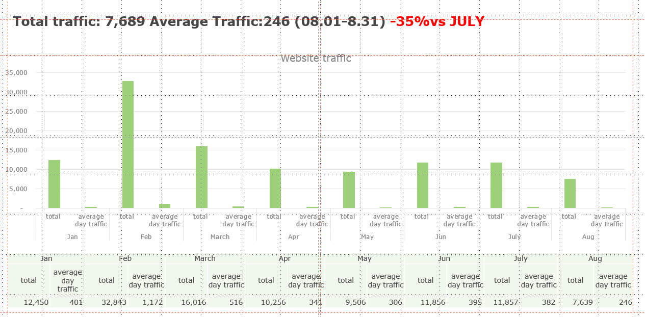
this graph is about traffic trends from Janunary to Augest in this year.
as you can see, the feberary traffic data was the highest and the Augest traffic data was the lowest
the reason why it happened was the effect of advertisement.
in Feberary we exectued adverstisement a lot such as snow and social media ad, search ad and so on, in Augest we rarely executed adverstisement as I already told you due to shoartage in budget. that affected the traffic apparently

Now, let's look the Augest traffic data closely.
The graph is regarding daily traffic trends in Augest.
as you can see, in the begining of Augest, the traffic is higher than the rest. we execute the searh ad in that period. it appears that it affected
'English Study' 카테고리의 다른 글
| [영어 표현] 영어로 문서에 돈 표현하기 KRW, USD, EUR 등 (0) | 2022.07.14 |
|---|---|
| [영어꿀팁] 연예인 누구 나오는 영화 봤어. 동사 ‘Star=주연으로 출연하다’ 표현 파헤지기 (0) | 2022.01.22 |
| [영어 꿀팁] 한국인이 어려워하는 발음, lyrics! (0) | 2021.07.23 |
| [영어표현] for god's sake. / Sake 표현법 파헤치기 (2) | 2021.07.17 |
| [영어표현] 곱하기와 배수 영어로 말하기 (0) | 2021.07.10 |
